THE GRAPHS ARE LISTED BELOW THESE EXPLANATIONS
The premise of CINCINNATI SINAI SERIES is relevant to your future. There are going to be substantial cuts in reimbursement for Medicare, Medicaid and SSI. Your opinion may be that manageable problems have been blown into political induced hysteria for sake of power and reelection.
The author would have you know he is concerned with ideas and would not bother writing such drivel. He endeavors in every way possible to give to you a real feel with an articulate, factual analysis, inside the web of fiction. This paradigm below is likely and he predicts you will experience this utilitarian view of medicine, first hand, unless changes are implemented. The CINCINNATI SINAI SERIES concerns itself, in part with the effects of these cuts in the real clinical setting.
Graphic proofs are important and will explain the following as a caption below each image. If the link is not present go to Google and press “images,” type in “graph”, and then the title of the graphic. It will pop up. You can track back to the source from there.
MOST OF THESE GRAPHICS HAVE BEEN DOWNLOADED FROM UNITED STATES GOVERNMENT WEBSITES
CLICK TO ENLARGE ALL IMAGES ON THIS WEBSITE.
LEARN. KNOW. READ. UNDERSTAND THE FUTURE.
READ THE CINCINNATI SINAI SERIES

GRAPH ONE The first graph from the CONGRESSIONAL BUDGET OFFICE shows that one out of two dollars will be reappropriated by the government by 2056. This graph is pre 2008 economic crash. The numbers are worse than this, the curve therefore coming sooner than predicted. Our debt is worse than these numbers. Also the prime interest rate is nearly zero. What if interest rates for our debt to China were at twelve percent rather than 3%? The interest would be far far higher than this. Go calculate a 30 year mortgage at 3% versus 12%. Look at the change in that amount of interest paid. Where would that money come from in the government budget? Military, medical and SSI. A question. Money is power to live our lives as we see fit in the pursuit of life, liberty and happiness. If the government has all the money, how do we pursue our dreams? Are we not then slaves, just Haitians living hand to mouth and dependent on government? If the government sops up one out of two dollars can you even have a market driven hospital system?

GRAPH TWO also from the CONGRESSIONAL BUDGET OFFICE shows that by 2049 that “entitlements” will exceed federal revenues. Period. (LUNGLORD has trouble with the very word entitlement- since these programs were sold to us as a social contract, with the full faith and credit of these United States under the name SSI SOCIAL SECURITY INSURANCE and MEDICARE INSURANCE, meaning dear reader we paid weekly “coverage premiums” for insurance coverage in good faith. It is only an entitlement for people who worked the off the books and never paid weekly payroll taxes or never worked at all in supporting this way of life. Again, GRAPH ONE says the one out of two dollars will directly enter government coffers before they go anywhere else. GRAPH TWO says that almost simultaneously to this in 2049 health care expenditures will exceed all the money the government takes in from all sources. You want a Roth IRA,

GRAPH THREE The number of elderly is increasing at an astonishingly fast rate. Better health care is double dipping the system. We are caring for them longer and with ever more expensive technology. At the same time we are paying them to stay alive. LUNGLORD is not unsympathetic, only documenting, the great growing disparity that must be reconciled. The average person only lived until age 60 in 1933 when SSI started and the average family was seven.

GRAPH FOUR A recapitulation of GRAPH THREE this one from Insurance Institutes. This projection is ten years old. The elderly have increased by 200% since 1950, and have lived ten or more years longer. .

GRAPH FIVE Dependent on the government totally now, these numbers will certainly grow as government replaces free markets with handouts and Americans have no where else to turn
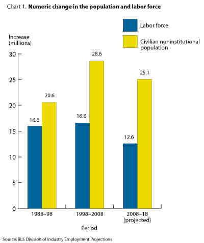
GRAPH SIX Fewer American jobs as products, services and employment moves offshore. How do we pay off such debt while shedding jobs? If our economy grows at 1% and our debt at 6% per year, how does society pay its hospital bill if it wants first rate medical care? Yellow bar represents everyone not institutionalized for crime, nursing homes, military and the like. Go here for a complete understanding of the yellow bar. http://www.dlt.ri.gov/lmi/pdf/lfconcepts.pdf The net effect according to this graph is a net slowing of growth in this country until 2018. The number of jobs is going to decrease in relation to those not working To see this graph and others like it. go to the below link. http://www.bls.gov/oco/oco2003.htm#Labor%20Force
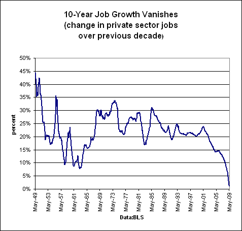
GRAPH SEVEN from a BLOOMBERG BUSINESS CHART based on U.S. LABOR DEPARTMENT STATISTICS. Job growth is depressed by outsourcing and consumer fears, therefore any real growth which might pay down the debt and balance payments is unlikely anytime soon, not until U.S. wages drop to parity with India and China and jobs return. Not on this chart— 760 Billion dollars leaves this country every year in oil, money which could stimulate the economy. 20 billion a month is sent home to foreign countries by workers here. Counting drug money leaving and foreign purchases of cars, TVs and so on, it is no surprise job creation is not occurring. How does one pay health insurance when one does not have a job- adding to the plight of hospitals trying to give good care.
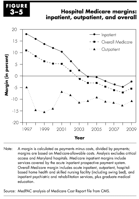
GRAPH EIGHT Hospitals are being cut in reimbursement. Look carefully at negative reimbursement. This is a diagnosis of medical rhabdomylosis- a catabolic state. Certainly, there is fat in the medical system. There is fraud. There is waste. But at some point a question must be asked, how long does a system last while burning muscle for energy? Ten years? Fifteen? At what point does quality deteriorate when costs are higher than expenses? Certainly, some hospitals are poorly run. These need to be taken over by capable institutions. Yet, this is a nationwide graphic, meaning it is occurring systemically in “all 57 states” to quote Obama.. This is not all Obama’s fault. Only 8 trillion is, enough to run the entire medical system of the United States for 14 years. From the previous graphs it is obvious more cuts are coming to health care. The Cincinnati Sinai Series concerns itself, in part in the effects in the real clinical setting of these cuts. By the way, what is MedPAC- which created the graph? Can it be trusted to be telling the truth? Or is it just a hack opinion generator. Not hardly. From their website, “The Medicare Payment Advisory Commission (MedPAC) is an independent Congressional agency established by the Balanced Budget Act of 1997 (P.L. 105-33) to advise the U.S. Congress on issues affecting the Medicare program.”
The

GRAPH NINE GAO (GOVERNMENT ACCOUNTING OFFICE) figures about the economic implications. The GAO is very conservative in their estimates. This graph is included so that the reader can understand this information is coming from more than one source inside government.
DIABETES GRAPHS- NOT RELATED TO ABOVE SUBJECT MATTER
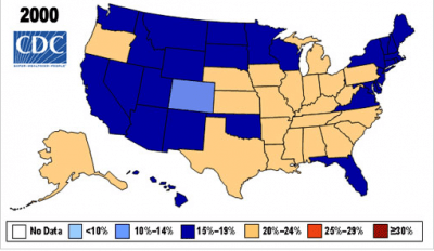
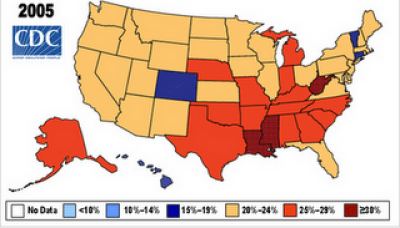
The incidence of diabetes is rising faster than a chocolate souffle’. The last graphs at the bottom shows obesity and diabetes, the largest one at the very bottom is an overly of the two maps. The correlation is nearly absolute.
Step away from the doughnuts and towards the oatmeal.
IS OBESITY WORSE NOW THAN IN 2007?


